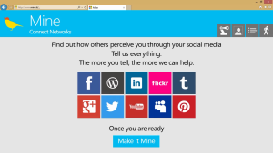
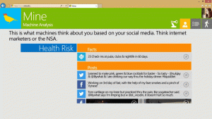
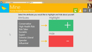
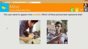
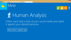
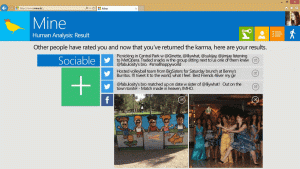
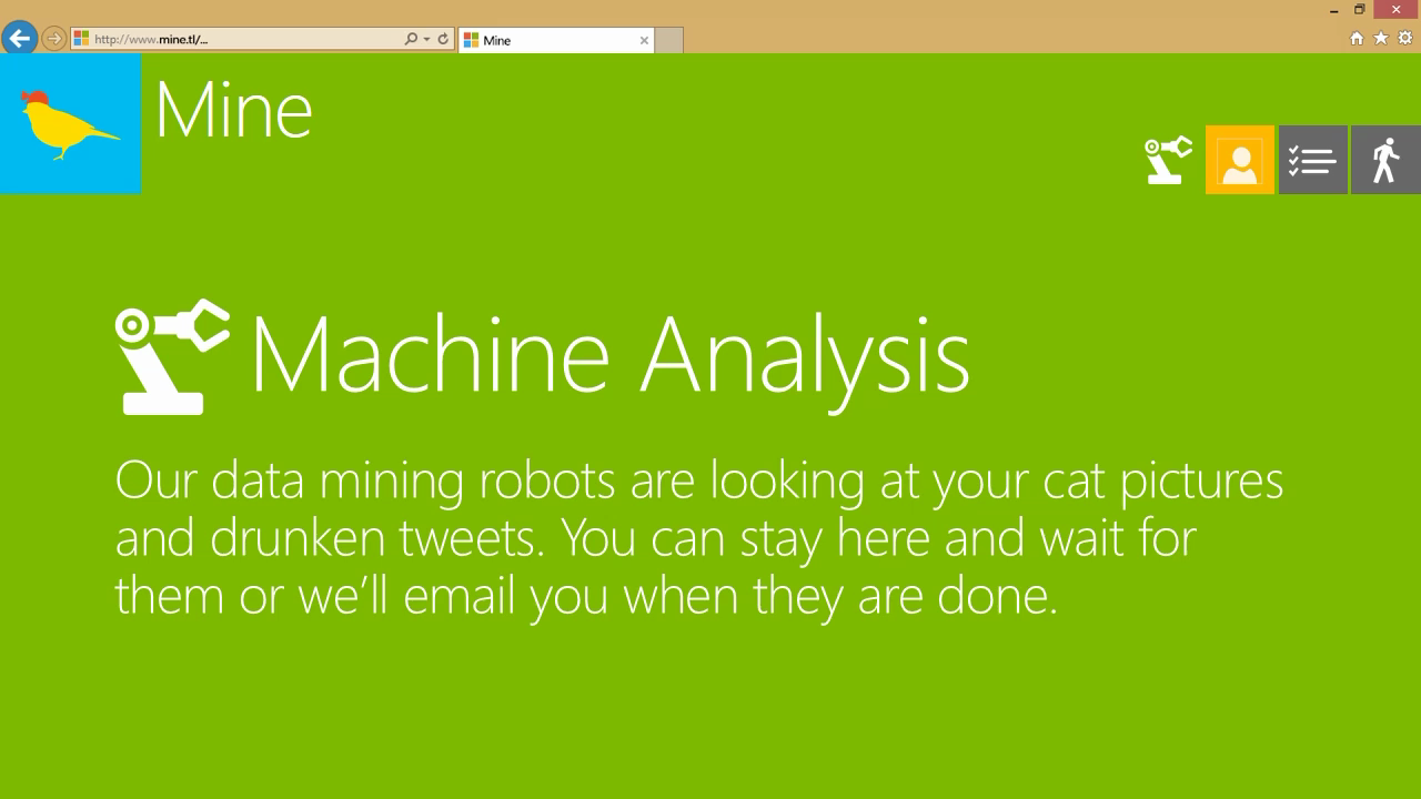
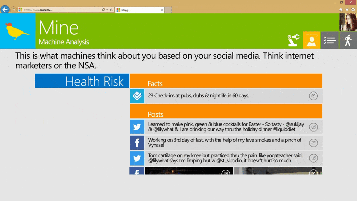
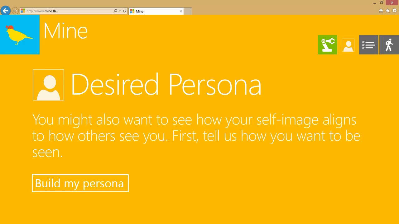
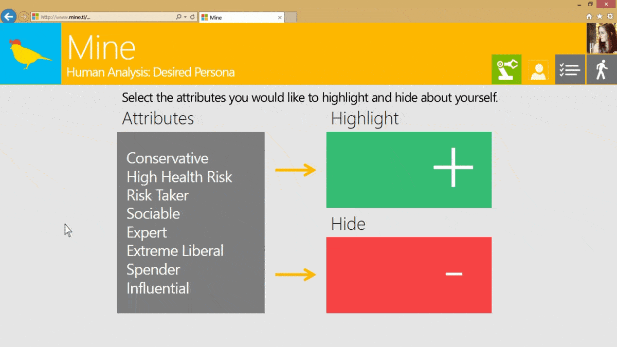
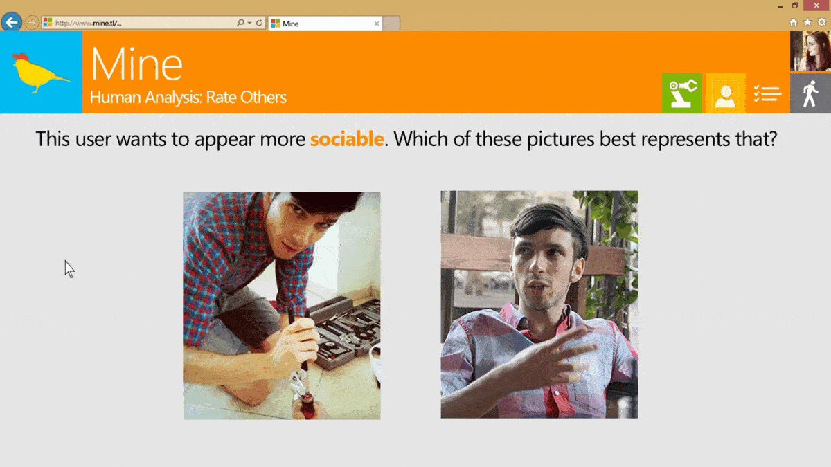
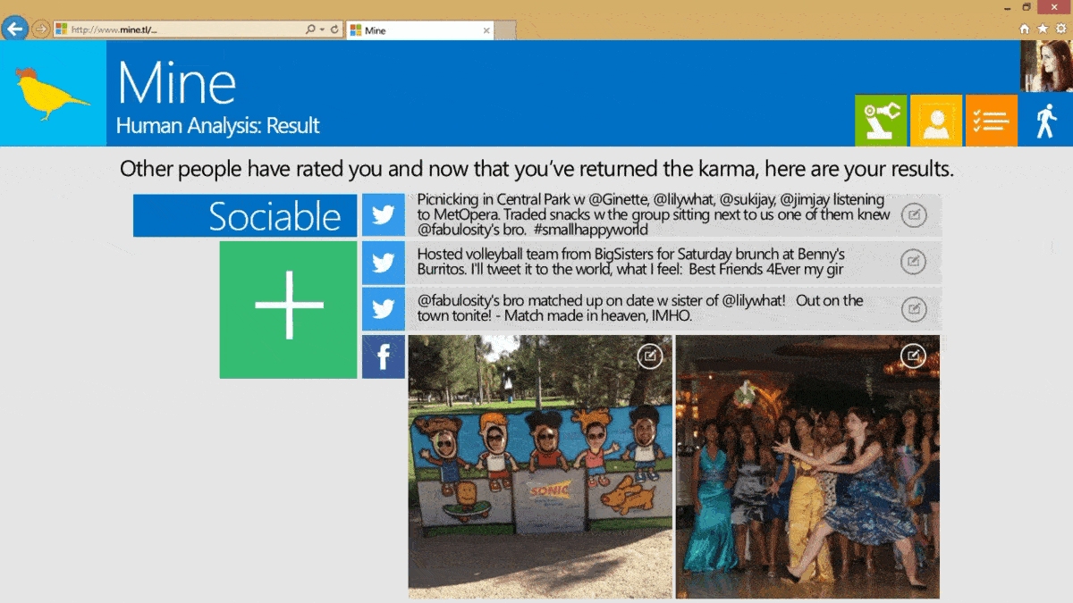
Mine is a service that allows you to see yourself like data-miners see you. It is about giving users insight into how their data is viewed by others. We split this into two realms: how individuals see you (e.g. Facebook, employers), and how machines see you (the NSA, advertisers, etc.).
My team developed the project under the supervision of Clay Shirky. It was part of a competition called Design Expo. The prompt for that year:
Given the available data, what can we invent that would improve the lives of individuals?
My use of the Metro design style was a nod to Microsoft’s part in the design competition:


Microsoft Research Faculty Summit
More of Mine
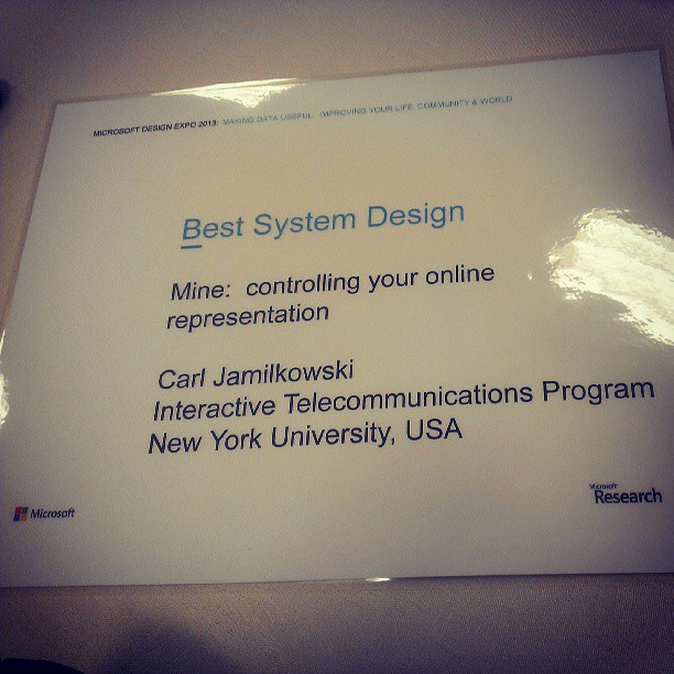
Award: Best System Design at the Microsoft Design Expo
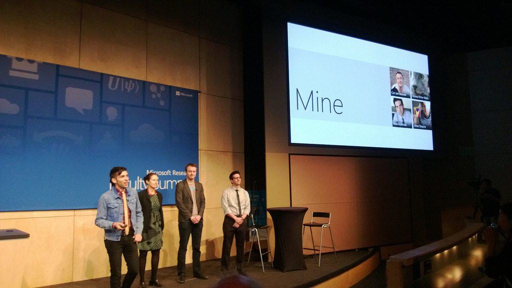
Mine presentation at the 2013 Microsoft Research Faculty Summit
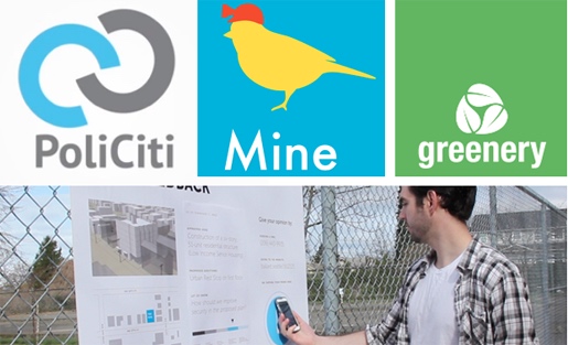
5 Civic Projects Aim to Make Data Useful
The Team
My team developed the project in a class taught by Clay Shirky at NYU ITP. It was presented at the 2013 Microsoft Research Faculty Summit as part of the Design Expo – “Making Data Useful: Improving Your Life, Community, and World” – where it won Best System Design.
My role: concept contributor, UI design, logo design, presentation design, Mechanical Turk user testing
Worked with: Omer Shapira, Donna Miller Watts, Michael Rothman
Professor: Clay Shirky